[Source: IMP Awards]
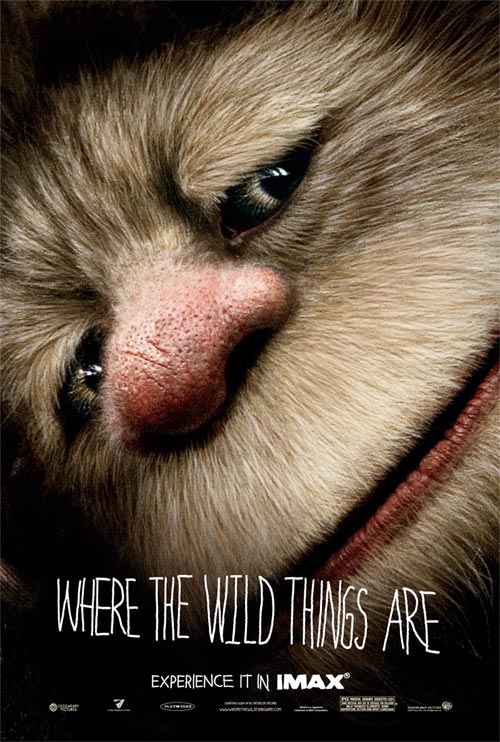
The “Where the Wild Things Are” marketers continue to demonstrate their chronic inability to put a foot wrong. Cinematical has unveiled another superb poster, this time for the IMAX release, and a further four character banners.
Thanks to The Film Experience for sharing this wittily out-there potential Australian poster design for “Antichrist,” which is still awaiting approval. You don’t need to have seen the film to know how daring this is, though it’s still on the right side of subtle. I love it.

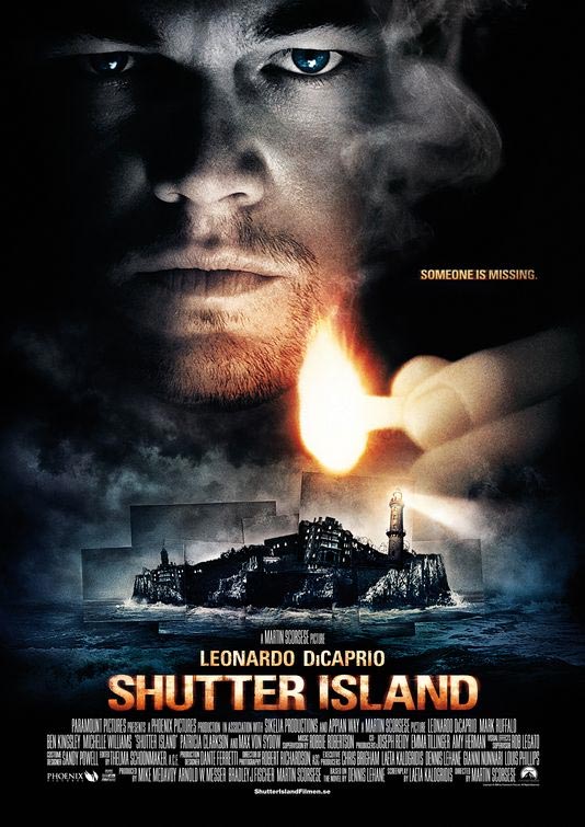
Friend and reader Nick just pointed me to this international one-sheet for Martin Scorsese’s “Shutter Island,” which apparently hit the web last week, though I must not have noticed.
Hardly a drastic departure from the domestic poster we saw last month — and while I like the clearer photo-collage motif here, I think the American design has the upper hand in typography, and a more arresting expression from DiCaprio. So after an international team trounced the U.S. designers in last week’s “An Education” one-sheet showdown, the scores are now level. Riveting stuff. What do you think?
Thanks to Glenn at Stale Popcorn for pointing out this Australian one-sheet for “An Education.” It’s not much more revealing of the film at hand than the rather vague American version, but for me, it’s a significant improvement in terms of design and composition.
And expression, too: Carey Mulligan’s melancholy moue gives slightly more indication of the dramatic stakes here than her impassive face in the U.S. poster. (Plus, showing a bit of Paris will always earn bonus points from me.) Looking forward to seeing what the Brit designers conjure up in the quad format.

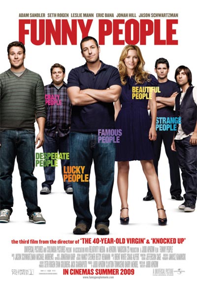
What follows is an actual conversation overheard this evening at Arsenal tube station in North London, as a (slightly inebriated) twentysomething couple stared idly at this international one-sheet for “Funny People.” I was so excited to hear strangers giving voice to my own musings that I began scribbling down a sneaky transcription. (Don’t judge me.)
What’s with all the poster action today? I can’t keep up. Anyway, in the interests of efficiency, I’ve paired up the new one-sheets for “Jennifer’s Body” and “Inglourious Basterds” (yes, another one) for your viewing pleasure. Why not? After all, they’re both advertising blood-spattered comedies from smart-aleck Oscar-winning writers, and they both seem destined to grace a lot of teenage boys’ walls, albeit for fairly different reasons.


[Source: Bloody Disgusting and Screen Rant]
I mentioned last week that I wasn’t entirely sold on the trailer for Jim Sheridan’s remake of the Susanne Bier drama “Brothers,” which played a little too shrill and on-the-nose for my liking. I have no such issues, however, with this superb poster: elegant, unusual and one of the few one-sheets I’ve seen lately that uses composition to intelligent thematic effect. Brownie points to all involved.

[Source: Cinematical]
Expanding on the teaser that generated much excitement among genre aficionados a few months back, comes this more revealing trailer for South African Neill Blomkamp’s freshman feature “District 9,” produced in association with Peter Jackson.
Can’t say I’m as sold on the venture as others are — and the new trailer makes it look rather broader and less enigmatic than what we were originally led to expect — but I’m always up for seeing my hometown of Johannesburg show its sun-bleached colors on screen. Represent, Joeys. (Newish one-sheet after the cut.)
You’re probably aware that the opening 8 minutes of Kathryn Bigelow’s staggering “The Hurt Locker” are available to view online. I’m not linking on point of principle — the increasingly popular tactic of marketing movies via isolated clips rather than trailers doesn’t sit well with me anyway, but in particular, an opening sequence as tense and electrifying as that of “The Hurt Locker” deserves to be experienced unspoiled on the big screen. Seek it out if you must, but I advise against it.
Meanwhile, IMP offers a pair of new international posters for the film: they’re nothing like as strong as earlier designs, but I guess floating heads still sell for some folks. Glad to see they’ve kept that terse tagline, though. Similar second design after the cut.

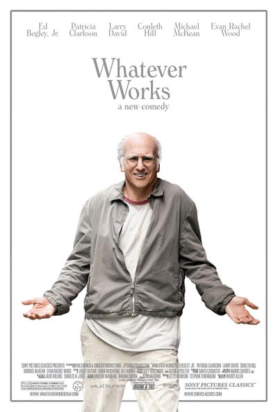
The sexy, teasingly framed artwork for “Vicky Cristina Barcelona” was one of my favorite posters of 2008. Suffice to say I cannot offer similar approval of this dreary new one-sheet for “Whatever Works.” Just how much time did they spend on it? And at no point did anyone on the design team meekly suggest, “Hey, Evan Rachel Wood is a hot young actress, and you know, the film’s biggest talking-point is the May-December thing she has going on with Larry David. Maybe, just maybe, it might be worth sticking her on the poster too?”
Sigh.
[Source: Vulture]
Admittedly, I don’t like that too-glib tagline. But just as with a similar tease shot in the trailer, this image alternately stops my heart and sends it racing. Conveying tension through a one-sheet is not easily done — this may not be the prettiest poster out there, but it’s certainly effective. Meanwhile, that sharp A.O. Scott quote forms a perfect description of what I always hope Kathryn Bigelow’s films will do, but so often fall just short of achieving.
Even if this year’s blockbuster lineup weren’t quite as unalluring as it is, this would be my most eagerly awaited title of the summer. I’ve been salivating since last autumn — the wait has been too long.
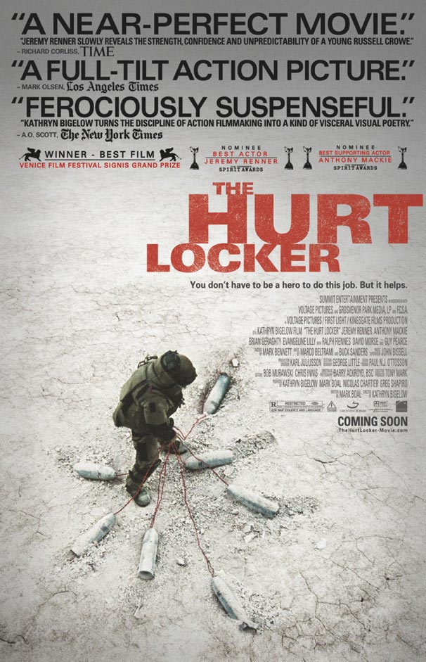
Yes, we’ve seen the image and typography already, but since they were so striking, why not carry them through to the poster too? I’m guessing this is not a design you’ll be seeing at your local multiplex any time soon — all the more reason to savour it:

[Source: IMP Awards]
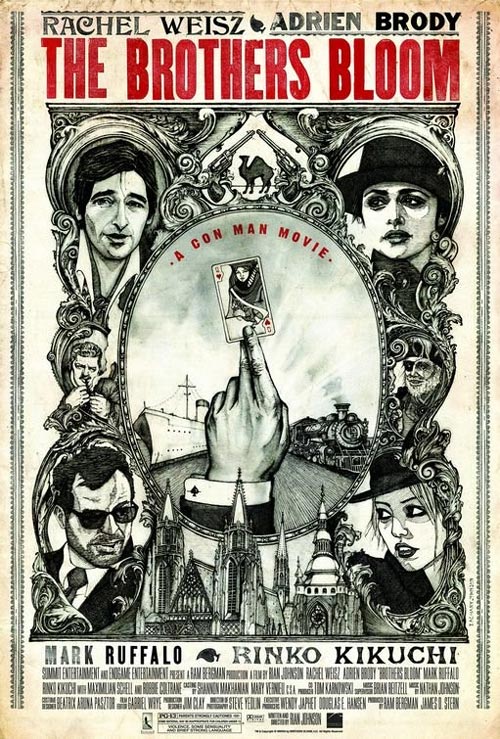
I may only be lukewarm on the film itself, but I wholeheartedly adore this poster design for “The Brothers Bloom,” which recalls (to me, at least) a 1970’s Robert Altman effort in its intricate, throwback Americana style. Dreamed up by director Rian Johnson’s cousin Zach, it seems it’s only being used for web purposes, though it captures the film’s retro preciousness a lot better than the thoroughly generic official one-sheet (pictured below the cut).
One quibble with both posters: I realize that Adrien Brody and Rachel Weisz are Oscar winners while Mark Ruffalo remains unnominated (where’s the justice in that?), but hasn’t the latter star at least earned the right to be billed above the title?
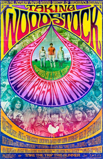
No, it’s not a vintage Grateful Dead gig poster, but it’s close enough. I love that this new one-sheet for Ang Lee’s upcoming “Taking Woodstock” made its first appearance on the Rolling Stone site. I love that they’ve fully embraced the fabulous-slash-hideous design possibilities of its era. And I love that a relative prestige picture isn’t disguising the tongue-in-cheek element in its marketing approach. Good work.
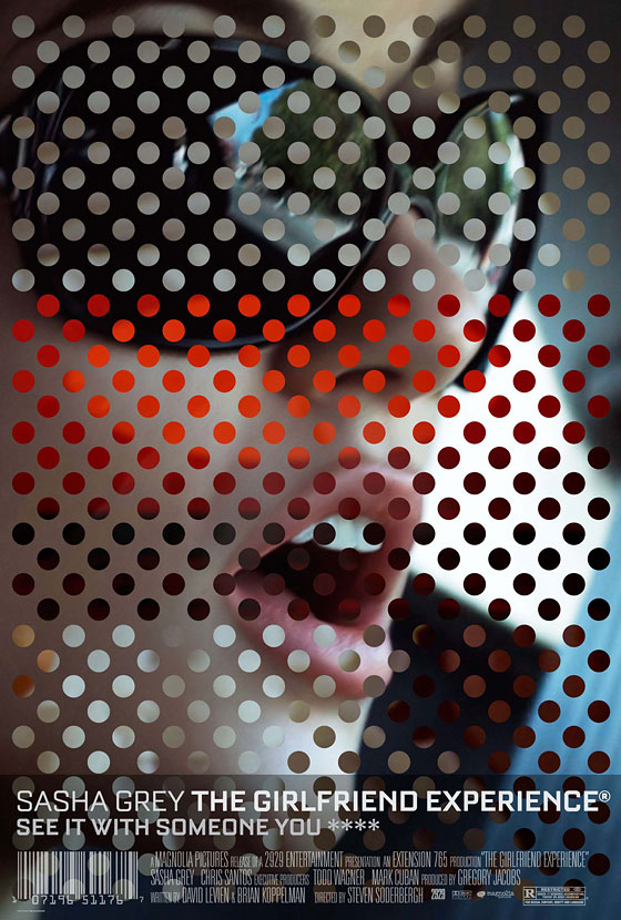
Until I actually get to see it, I have absolutely no idea what to make of Steven Soderbergh’s “The Girlfriend Experience” — which, if you haven’t heard yet, is a breakthrough vehicle for multi-award-winning ingenue Sasha Grey. Soderbergh’s lo-fi experiments work for me approximately half the time, so I’ll just have to see which side of the fence this one lands on.
But however the film turns out for me, there’s no denying that this is an absolutely first-rate poster, from the graphic concept to the typography to that killer tagline. Great work all round.
[Courtesy: Vulture]
Yesterday’s post about the UK poster for “Let the Right One In” alerted me to the existence of a nifty little site. Not a Movie Poster showcases notable poster concepts that were ultimately rejected by the powers that be — usually, it seems, in favour of far lesser work.
They are mostly UK designs (hence the quad format) for arthouse releases, and there is some really masterful work in the mix. It’s so rare that you see film poster design of this calibre these days — what a shame that the marketers aren’t as adventurous. Take one of my favourites, this rejected design for “I’ve Loved You So Long”:

Now, how much better is that than the one they went with? Two more favourites,for “4 Months, 3 Weeks and 2 Days” and “Elephant,” after the cut.
Believe it or not, “Let the Right One In” is still awaiting its UK theatrical release — for whatever reason, the powers that be decided to hold it back until April. (But hey, at least we got “Hunger” ages ago.)
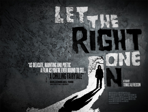
Anyway, if the delay meant more time to devise a poster as brilliant as this one, perhaps it was all worth it. It’s rare that a poster really utilises the spacial possibilities of the UK quad format, but this nails it — an early contender for Poster of the Year, even if the film was, y’know, last year: