 By now you’ll have heard that the most celebrated set in “The King’s Speech,” that of Lionel Logue’s shabbily spartan office, was also used in a video by British gay porn producers UK Naked Men — which I’ve since discovered is called “Snookered,” and is readily available online. (Click at your own risk — decidedly NSFW/C.)
As Kris pointed out yesterday, the folks steering “The King’s Speech” will be grateful this embarrassing news nugget wasn’t unearthed a few weeks ago, as opposed on the last day of Oscar voting. Still, I imagine a number of Academy figures are now crossing fingers in the hope that the film doesn’t emerge victorious in what appears to be a tight three-way race for Best Art Direction.
The news spread rapidly across the internet yesterday, leaving ripples of laughter in its wake — but aside from its amusement value, the situation does raise interesting questions about how people define award-worthiness in this particular craft field, and how aware they even are of what went into the work they’re voting for.
 The art directors settled on a wonderful quintet to represent their form in 2010. Each of these films (okay, I haven’t seen one of them) manages to showcase art direction in organic ways, even when it comes to the contender with the most robust and vibrant design to offer.
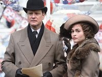
 Yesterday I began a final look at the crafts categories. Today, a look at the four remaining fields: Best Art Direction, Best Cinematography, Best Costume Design and Best Film Editing.
 Oh how things have changed since I last wrote in this space. In the past four weeks, Tech Support has taken a break, allowing the dust from the festival circuit to settle, and other titles to open. Over the next 10 weeks, we’ll take a second look at each of the crafts categories, finishing in mid-December – just as awards circuit takes hold.