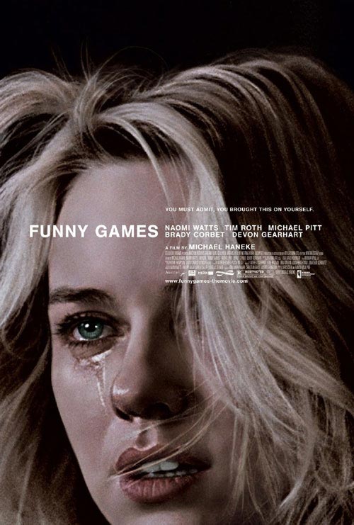
Three weeks into the new decade, the flood of lists rounding up the last one seems to have abated, but I enjoyed Stale Popcorn’s countdown of the decade’s best film posters, whose #1 coincides with that of a similar list on The Auteurs last month. (They have an interesting interview with designer Akiko Stehrenberger here.) The same poster is one I’m starting to see crop up on the walls of assorted designer/cineaste locales — plainly a modern classic, even if the film is plainly not.
Comments
21 responses to “Sight for sore eyes”
I’ve never seen or heard of such a difference in opinion between a movie and it’s poster, but this poster is the type that inspires lists like that, though movie looked like utter shit.
I personally wouldn’t call it “utter shit,” but it’s a fascinating, perplexing misstep. Naomi Watts and Michael Pitt are terrific in it.
I saw the 1997 version of this movie, which didn’t make me want to see the remake a couple years ago. I heard they are the exact same, with the exception of what language they are spoken in and different actors.
Shot-for-shot, in fact. But the wholly different cultural contexts of each film make them very separate works. The original is superior.
I *fucking* hated this movie, and I don’t see what’s so special about this poster.
The first half of the sentence I completely sympathize with. The second … them’s fightin’ words, Robert!
I think this is one of the best posters to include a star’s face, BUT still, it’s just another cliched poster featuring the star from the movie.
This guy also chose “Mullholand Drive” on his list, so maybe he has a thing for Naomi Watts. Some of the posters from Pedro Almodovar should have made the list over the two selections from movies from David Lynch.
So many people have written off this film because they didn’t understand its satirical nature. I don’t mean to sound pretentious because I hate the “oh, you just didn’t understand the film” argument, but in this case, I think it applies on a surface level.
I’ll be the first to say that the film is less than exciting, but that’s what Haneke sets out to do. He sets out to make a horror film that’s authentic and not just some studio brown noser. Real-life horror doesn’t follow an archetypal narrative pattern like most of its film representations do.
Haneke forgoes suspense because it’s not there in real life. The minutiae gives meaning to the film.
-The kid getting killed first.
-Our cut away when he gets shot, because we all know the American public loves to watch its blood shed and shake its collective head simultaneously.
-Naomi Watts struggling with the handcuffs for 10 minutes, vastly different from the usually lucky jimmying of the key that was somehow by the chair leg.
-The anti-climax of pushing her off the boat when you think they may be taking her somewhere for a grandiose finale.
It’s a really smart picture, and I think a lot of people missed that because it was not very endearing to most film goers. It’s a critique of the way filmmakers craft their horror films in a dying genre, and it’s also satirical in regards to the American public (I do belong to this group, btw), a body of blood-thirsty viewers that loves to chastise people in horror films for their stupidity and violence when we are the ones going to watch it.
How can either of these lists ignore Walk the Line’s stunning poster? I can’t believe both forgot it.
I just noticed the first list had it in their bottom half. I’d say that’s too low but at least they included it.
CAUTION: MILD SPOILERS FOR “FUNNY GAMES” AND “CACHE” BELOW
@Zan: Most of us have written it off because we saw the original Funny Games and saw no reason to see a shot-for-shot remake. I think that the fact that Haneke believes the remake NEEDED to exist is far more fascinating than its actual existence. The fact that American culture hasn’t taken the original film’s message to heart and Haneke felt that, in order to reach the audience that needs to see it most (not the cinephiles who already grasp it, but the average movie-goer that still indulges in such behavior), he had to remake it in English with famous people. I’m sure that Funny Games U.S. is good in the same way that the original is good (Haneke is always good for at least one stunning visual moment–in Cache, it was Majid’s suicide, and in Funny Games, it’s Paul grabbing the remote control and rewinding the film itself), but I don’t know what I’ll glean from it upon seeing it in English that I didn’t get the first time.
With the exception of The Piano Teacher, I think that I like the ideas behind Haneke’s films more than I like the films themselves. However, I’m holding out hope that The White Ribbon delivers.
One more thing while we’re on the topic of Funny Games: while I know many people disagree with me, I think that the thematic turf of Inglourious Basterds is not dissimilar to that of Funny Games. The key difference is that Haneke pushes it to the forefront in very obvious ways (largely Paul’s breaking of the fourth wall) while deconstructing narrative structure, while Tarantino keeps it bubbling just beneath the surface, threatening to boil over at any moment, and he does this within the confines of a much more traditional structure of film narrative that an average movie-goer could follow with more ease. I consider the latter to deal with the subject matter quite smartly, while the former can be obnoxious.
Two great posters that I didn’t see mentioned anywhere: Syriana and Before the Devil Knows You’re Dead.
Adam, I tend to agree that the ideas and context of Haneke’s films are praiseworthy, but the painstaking process of watching them isn’t necessarily worth the payoff.
I’m actually watching The White Ribbon at this moment, and through the first hour, it’s so well paced that it rivals Cache in that department. It’s also not as demonstrative in its style; more often than not, I prefer subtlety.
Demonstrative in style as Funny Games **
Profanity police (see above) Kris…where are you??
Shouldn’t they get a first and last warning also (like I did), or does that rule just apply to me??
Huge difference. It wasn’t about profanity. Can’t help you if you don’t see that.
As to the topic at hand, this was definitely amazing poster, for a film I absolutely LOATHE.
I didn’t see the remake because I saw the original and didn’t like it. No point wasting my time just because I like Watts. It is, however, a truly stunning example of poster art. There are so many ways they could have taken the same ingredients (image of watts, plain title, etc) and done something completely generic and dull (something involving stripes or a lot of empty space for no reason whatsoever) but what they gave us was a fascinating (is it painted or a movie still? the interview linked above tells you) and captivating poster. Rarely do movie stills provide such stunning central images for a poster – I think they’re lazy – but this one did just the trick. Plus a stunning tagline and just an overriding sense of hopelessness. Love it.
(yeah, I’m the person who actually did the list).
AZ, I liked the poster, but I dunno… something seems so obvious about it. LOOK AT US WE’RE BEING ARTSY! etc.
Lance, if you read my piece you’d see I admit to possibly being biased towards the “Mulholland Drive” poster since it is my favourite film of the decade, but I thought that design had such an overriding sense of seedy LA mystery. However, you think the “Funny Games” poster is a cliched one with a big face on it so I’m not sure I can really argue with you about the merits of poster art.
I had never noticed the tagline before — I suppose I hadn’t seen a big enough version of the image. I also just realized that the tagline is in iambic pentameter. Double spooks.
Well I for one, believe the poster is terrific. Though, the movie looked kind of stupid. It’s a shame when good art is wasted on bad art.