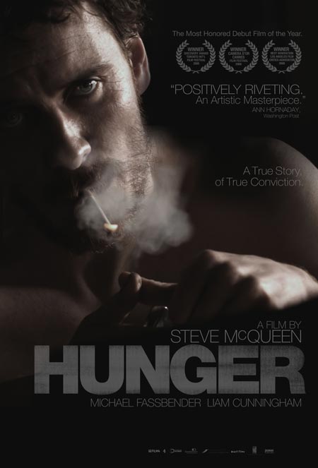
I like it. I preferred the more abstract artwork on the UK poster, which was an extreme closeup of his ravaged ribcage, but that didn’t seem to sell too many people on the film here. Hopefully this will do better.
It had a one week Oscar qualifying run in December in the US, so it would not be eligible for ’09 Oscars.
Sound Designer Dan
Saw this yesterday and wow. Just WOW.
Kevin
This poster has to be one of the best I’ve seen all season. The black background is enveloping but does not overshadow the internsity of Fassbender’s eyes. Anyone else notice that the words ‘positively riveting’ are directly next to Fassbender’s eyes, which can be described in just the same way. The cigarette smoke and grey type definitely enhance the bleakness of the subject matter – it’s very artfully done.
Guy: I don’t blame the Brits – who wants to see skeletal frames as advertising?
If all you’re going to do is use a movie still and throw some text on there and call it a poster then at least choose an image that’s a bit more interesting.
But, then again, I really didn’t like “Hunger” at all.
Comments
8 responses to “‘Hunger’ poster”
sick
I like it. I preferred the more abstract artwork on the UK poster, which was an extreme closeup of his ravaged ribcage, but that didn’t seem to sell too many people on the film here. Hopefully this will do better.
I can’t wait to see this.
So is this a 2009 US release ? Could this actually get in the mix next year.
Ashamed to say I never saw this here in Blighty last year. Still it’s on DVD now…
Rob,
It had a one week Oscar qualifying run in December in the US, so it would not be eligible for ’09 Oscars.
Saw this yesterday and wow. Just WOW.
This poster has to be one of the best I’ve seen all season. The black background is enveloping but does not overshadow the internsity of Fassbender’s eyes. Anyone else notice that the words ‘positively riveting’ are directly next to Fassbender’s eyes, which can be described in just the same way. The cigarette smoke and grey type definitely enhance the bleakness of the subject matter – it’s very artfully done.
Guy: I don’t blame the Brits – who wants to see skeletal frames as advertising?
If all you’re going to do is use a movie still and throw some text on there and call it a poster then at least choose an image that’s a bit more interesting.
But, then again, I really didn’t like “Hunger” at all.