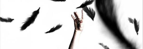
It’s clearly Poster Revision Day or something, as this new concept for Darren Aronofsky’s “Black Swan” (you may have heard of it by now) builds and improves on the simple head shot unveiled in August — while maintaining its pristine, counter-intuitive snow-white sheen. Obviously, nothing’s going to top those Art Deco-inspired teaser designs released last month, though it seems this one has at least incorporated a key visual metaphor from one of them. See if you can spot it.

Comments
18 responses to “New ‘Black Swan’ poster”
What’s up with Natalie’s left arm? Did they really need to have it bloody red?
I think I see a swan face (the red arm being the beak), but I might be just as unhinged as Natalie’s character…
“Did they really need to have it bloody red?”
Uh, it kind of makes the poster.
I’m not liking this one too much. The original poster was better, and somehow classier. There is awkwardness to this poster that I just don’t like. Plus the feathers behind Natalie’s head are making it look like she’s wearing a christmas hat.
I like it and I don’t mind the awkwardness of it. The movie is intended to be strange. It would be false advertising for something more serene.
On a completely unrelated topic, Guy are you loving Fish Tank getting the Criterion treatment?
It’s not the greatest poster I ever saw, but it’ll do. I agree that the red arm makes the poster.
Brentg: In principle, yes, I’m thrilled. Honestly, however, Criterion discs are both inaccessible and unaffordable to me here in the UK. I must confess I don’t own a single one.
Is it really that difficult to obtain Criterion discs in the UK? I wouldn’t have thought so. I also find them too expensive, but once in awhile there will be a good sale on them (like Barnes & Noble’s twice-a-year, 50% off sale that’s going on as we speak). Anyway, that’s unfortunate and bizarre that a cinephile overseas can’t enjoy the fruit of the label’s labors.
woww! Amazing poster!
I fucking love everything about this movie, and I haven’t seen it yet. Not as cool as the trippy art-deco inspired posters from a few weeks ago, but this image is much cooler than the majority of posters being released this year. I hope this movie doesn’t go wide in January b/c I want to see it NOW (or at least sometime in December would be nice.)
@Keil Shults – Thank you for mentioning about the Barnes & Noble Criterion sale! I need to do some XMas shopping for friends and family and that will be nice to get it done this week! I’ve aquired 15 Criterions over the years and am planning on picking up about 4 more for myself this year (I am looking at Antichrist in particular.) What’s the point of shopping for others when you can’t get things for yourself?
p.s. – does anyone else think Natalie’s pose is similar to the whole Bjork Vespertine era (swan dress imagery)? This image in particular pops in my mind when thinking about Black Swan: http://www.wikizic.org/1-004-004388-Bjork.jpg
@Michael – are you me? Except: I brought my tally up to 25 during the last B&N CC sale. I also plan to add a few more (including Antichrist) to my collection whilst buying for others.
Also, loved the film and love this poster.
The expression on her face and the makeup and the weirdness of the pose are exactly what I want from this movie!!! Glamour, intensity, and strangeness. I LOVE this poster and I can’t wait for the movie to open!!
Hrm. Adore the movie (seen it twice so far), the teaser designs, and the first classy-yet-creepy domestic poster, but something about this rubs me the wrong way and doesn’t seem terribly representative of the film.
This poster is… not so good. Looks more like an editorial from a fashion mag. Or a still from a bad music video. But, then, I liked the white face design and Kris did not, so… Still, are the feathers meant to be forming the shape of a swan?
I liked the first poster better, too. I even preferred it to the very good Art Deco ones.
In terms of carry-overs from the film: given the angle and placement of the scarlet hand, you might say that Nina Sayers is getting caught red-handed at… something. Hope she doesn’t go blind.