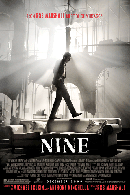
The light looks a little artificial but, overall, I dig it.
“Reminds me somehow of The Dark Knight!”
That’s exactly what I thought too!
Maybe it’s the shape of the structure behing DDL or the color scheme but is did get a Batamaneque vibe out of this poster.
The font and the unattractive red colour they have used should’ve been changed. However, if they’re just going to be using shots from the movie, why photoshop them to within an inch of their lives and make them look fake and phony?
aristo
Shameless Dark Knight marketing ploy !
Shame on you Har-vain !
Spencer
I much prefer this poster to the other ones !
“This holiday season, be italian” made me cringe and i lost just a little bit of faith in the film, and in rob marshall, lol.
This poster seems very simple and elegant, similar to those that were made for “Chicago.” I always liked the “Chicago” posters with the giant “c” in the background …
j
Yeah, if you didn’t keep up, you would have no idea who that guy is. Luckily, you get reminded twice that this is from ROB MARSHALL.
Comments
14 responses to “Latest ‘Nine’ poster puts Daniel Day-Lewis on the couch”
I actually don’t like this poster very much.
MUCH better than yesterday’s.
Reminds me somehow of The Dark Knight!
A million times better, mainly because it drops that awful “Italian” tagline that’s just laughable.
Is it true the Nine embargo breaks today? cause that’s what they’re saying at thefilmexperience.net
This is nice, but not big on the font of “Director Rob Marshall” etc. And what do they mean by ‘Nine embargo’??!?!
All of these posters need more DDL.
This poster needs more DDL!
The light looks a little artificial but, overall, I dig it.
“Reminds me somehow of The Dark Knight!”
That’s exactly what I thought too!
Maybe it’s the shape of the structure behing DDL or the color scheme but is did get a Batamaneque vibe out of this poster.
He looks like he’s considering pulling a Tom Cruise on that couch. It’s about time that Daniel Day-Lewis lets his freak flag fly.
LOVE this poster.
The font and the unattractive red colour they have used should’ve been changed. However, if they’re just going to be using shots from the movie, why photoshop them to within an inch of their lives and make them look fake and phony?
Shameless Dark Knight marketing ploy !
Shame on you Har-vain !
I much prefer this poster to the other ones !
“This holiday season, be italian” made me cringe and i lost just a little bit of faith in the film, and in rob marshall, lol.
This poster seems very simple and elegant, similar to those that were made for “Chicago.” I always liked the “Chicago” posters with the giant “c” in the background …
Yeah, if you didn’t keep up, you would have no idea who that guy is. Luckily, you get reminded twice that this is from ROB MARSHALL.