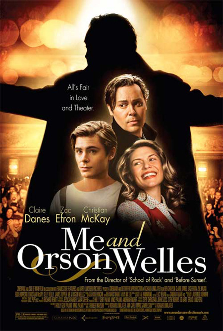
And is saying this film is from the director of “School of Rock” supposed to be some kind of draw? It’s not really a terrible film but “Me and Orson Welles” doesn’t really seem like it would draw the same crowd.
Guy Lodge
Good lord, that’s awful. (And what on earth did they do to Claire Danes? I wouldn’t recognise her from that picture in a million years.)
Adam Smith
Truly terrible. Whoever wrote that tagline needs to be sent straight back down to the mailroom.
Jesus. That looks like bargain bin material. I’m still excited for the film, though.
Andrew
You couldn’t come up with a less flattering photo of Claire Danes if you tried. And what’s with the lighting on McKay?
And is anyone else as sick of this title font as I am?
Abi
It looks like a graphic design student’s project where they have to include 3 or more fonts, 5 or more blending effects, and at least one 1 difference of scale. So formulaic.
Comments
7 responses to “‘Me and Orson Welles’ poster”
lame ville
Looks… lazy?
And is saying this film is from the director of “School of Rock” supposed to be some kind of draw? It’s not really a terrible film but “Me and Orson Welles” doesn’t really seem like it would draw the same crowd.
Good lord, that’s awful. (And what on earth did they do to Claire Danes? I wouldn’t recognise her from that picture in a million years.)
Truly terrible. Whoever wrote that tagline needs to be sent straight back down to the mailroom.
Jesus. That looks like bargain bin material. I’m still excited for the film, though.
You couldn’t come up with a less flattering photo of Claire Danes if you tried. And what’s with the lighting on McKay?
And is anyone else as sick of this title font as I am?
It looks like a graphic design student’s project where they have to include 3 or more fonts, 5 or more blending effects, and at least one 1 difference of scale. So formulaic.