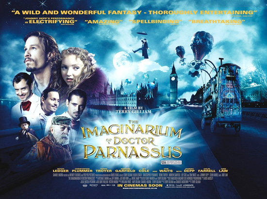
Looks like fantasy. For those that have actually seen the movie, does the poster represent it properly?
david
It would be wonderful if this film was a return to form for Gilliam. His last two films (Brothers Grimm, and Tideland) really were quite disappointing (sorry…Fear and Loathing in Las Vegas is a guilty pleasure for me).
Comments
7 responses to “UK ‘Parnassus’ quad”
Looks like fantasy. For those that have actually seen the movie, does the poster represent it properly?
It would be wonderful if this film was a return to form for Gilliam. His last two films (Brothers Grimm, and Tideland) really were quite disappointing (sorry…Fear and Loathing in Las Vegas is a guilty pleasure for me).
hmm not a fan of this quad really… from this reminds me of a Harry Potter movie.
Terrible poster/ quad for an incredible film. A bad representation
The title font reminds me of Mr. Magorium’s Wonder Emporium for some reason.
I imagine I will be sad by the time the end credits start rolling.
That’s seriously a “Harry Potter” design.