Believe it or not, “Let the Right One In” is still awaiting its UK theatrical release — for whatever reason, the powers that be decided to hold it back until April. (But hey, at least we got “Hunger” ages ago.)
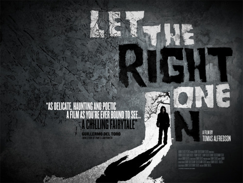
Anyway, if the delay meant more time to devise a poster as brilliant as this one, perhaps it was all worth it. It’s rare that a poster really utilises the spacial possibilities of the UK quad format, but this nails it — an early contender for Poster of the Year, even if the film was, y’know, last year:
Comments
10 responses to “The right one”
Not only does it make the most of its spacial formatting, but also the colour scheme superbly captures the look and feel of the film with its stark contrast of black and white.
This is much better than any poster I saw last year.
I got this DVD from Netflix today, can’t wait to watch it.
Immediately after watching it, I didn’t think much of it. But it has stayed with me more than just about any 2008 release.
I watched this a few days ago, and I loved every minute of it. I thought it was going to be overhyped, but it wasn’t.
I love love love this movie. You can see it in May if you don’t mind flying to Charleston WV for the WVIFF.
Tell me about it, there isn’t even a date set here in the Netherlands.
But couldn’t they find an actual quote from a critic instead of Del Toro? Or is that too nitpicky?
Poster looks Criterion-ish.
Film is overrated although pretty good. Definitely the best Swedish horror film I’ve ever seen though.
Like the poster though, although surely they could have done a very similar and equally effective design in the traditional format (ie portrait layout, which is def more appealing.)
AdamL: The quad IS the traditional format here in the UK. It takes some getting used to, but I’m fond of it.
“Definitely the best Swedish horror film I’ve ever seen though.”
How many have you seen, though? ;)
I’m pretty fond of Bergman’s “Hour of the Wolf,” myself. Hard to top. But I shall see.