 Last week, Kris and I came to a disagreement over the merits of Oliver Stone’s splashy, silly and consistently surface-level sequel “Wall Street: Money Never Sleeps.” Neither of us is disputing that the film is a mess, but where Kris thought it clumsy, ill-judged junk, I was more forgiving in my Cannes review: for me, the film partially succeeds on the level of campy self-satire.
One thing we can both agree on, however, is that subtlety is not in the film’s vocabulary — least of all when it comes to its gaudy collection of visual cues and symbols. Four months after watching the film, the one that sticks most insistently in my mind is a certain highly recognizable painting in the office of Josh Brolin’s character Bretton James.
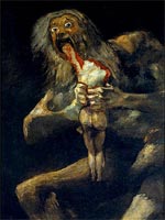
Not content with underlining James’s Mephistophelean deviousness by clothing Brolin in a maroon-colored suit, Stone and ace production designer Kristi Zea (“GoodFellas,” “Revolutionary Road”) have Francisco Goya’s “Saturn Devouring His Son” (pictured) as his office backdrop to drive home the capital-E Evil of the character.
This, along with the film’s other, marginally less outrageous choices of artwork, is the subject of this interesting New York Times profile of Fanny Pereire, art consultant to “Money Never Sleeps” and a previous collaborator with Zea on such titles as “Changing Lanes” and, again, “Revolutionary Road.”
In the piece, Pereire discusses her reasoning behind the pieces selected for Stone’s film — from Goya to revered contemporary sculptor Antony Gormley — the combined effect of which is intended to suggest a more economy-minded society than that of the original 1987 film. (The excesses of that era, you might recall, were symbolized by the luridly extravagant decor schemes of Daryl Hannah’s interior designer character, making the new film’s high-end art collection an appropriate visual bookend to the original.) She explains:
“There was a time,” Ms. Pereire said, “when some people felt that at every dinner party, they had to have something different hanging on their wall.” Unwanted pieces were relegated to storage. Today such acquisitions are more likely to stay put, destined to survive both market fluctuations and the vagaries of style. Less breathlessly hip than the works on display in the original “Wall Street,” they are often just as grand.
That Goya painting, meanwhile, is described as part of an effort on Stone’s part “to invest his characters with mythic dimensions.” Or, you know, as a bit of tongue-in-cheek visual jokery. The jury’s still out. Either way, it’s nice to see an aspect of non-period production design coming in for some discussion. One wonders if the Art Directors’ Guild might reward Zea (who, incidentally, enjoys the unique distinction of having been Oscar-nominated in both the Best Picture and Best Art Direction categories, and for different films at that) with a nod.
[Image: Wikipedia]
Comments
14 responses to “On the art of ‘Wall Street’”
While I recognize that the film’s script is a bit all over the place, and too kitschy/self-satirical/flashy for ultimate accolades, I still enjoyed the film, liked the acting, & found it entertaining, overall. I didn’t mind the visual fluorishes (effects), and I found the art direction (furniture, paintings, designs), clothes, & jewelry to be stunning; if overindulgent.
I haven’t seen the film, so I probably shouldn’t commit on it, but I have a hard time believing the word “self-satire” is in Oliver Stone’s vocabulary.
Neither “Wall Street” nor its sequel work, but the second one was a tad better, mainly because it was stylish on the surface. I think Rodrigo Prieto’s cinematography is ace, for instance.
Patriotsfan: Well, that’s the very point Kris and I disagree on. Plenty of room for argument.
On the self-satire: I don’t necessarily think it was intended, but the finshed product is the finished product, and I (mostly) enjoyed the ridiculousness of parts of the film.
I think there is an element of satire but nowhere near as much as people are saying. The editing was the weak point. To many flash cuts in the middle of conversations to something else, and weird hyperactive choices. It’s more Wall Street by way of Any Given Sunday or something Tony Scott would do.
All in all I still really enjoyed it.
Guy: True, there is always room for argument, and since I haven’t seen the film, I don’t really know what my opinion would be. When (or if) I see the film, I might agree with you, but judging from the Oliver Stone films I have seen and my opinion of those films, I tend to think I would probably agree with Kris. The other good point that JJ1 makes though, is even if Oliver Stone did not intend for any self-satire, it is possible to perceive the film that way and enjoy it on that level. Either way, it is an interesting debate and does make me more interested in seeing the film.
Ah so the domino bricks and the soap bubbles were masterpieces of art?
Big difference between an Antony Gormley sculpture and the domino bricks, Jonathan, and you know it.
What is the photo calle of the man riding a motorbike on his stomach in the office of Josh Brolin’s character Bretton James.
What is the photo called of the man riding a motorbike on his stomach in the office of Josh Brolin’s character Bretton James.
Lisa, the photo was published in Life Magazine, and it is Roland Free in Bonneville Salt Flats, 1948, breaking speed’s world record. i dont know who took it though.
Thanks alot! :-)
Hi !
Who shot the large photography prints seen on the wall (desert road…).