
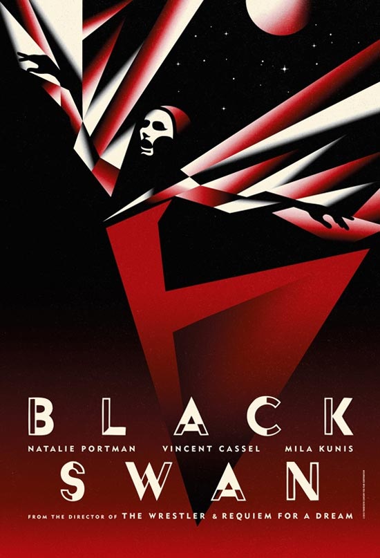
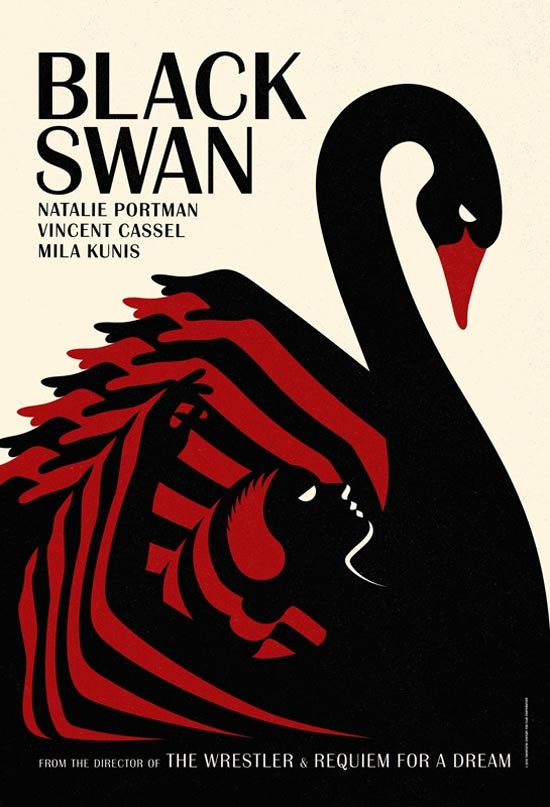
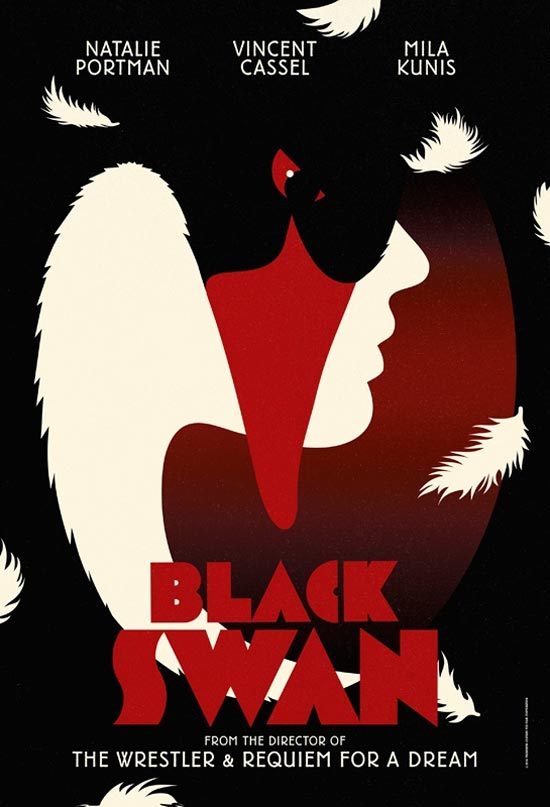
Okay, now we’re talking. By now, you should be quite familiar with the US one-sheet for Darren Aronofsky’s “Black Swan” — an attractively demure (and unexpectedly snow-white) design that coyly masks the sexy, shadowy craziness served up by the erotic ballet thriller. Now, however, a set of four international teaser posters have landed via Empire — and they certainly aren’t hiding the crazy. Love the alternately Expressionist and Art Deco flourishes and the stark, uniform color palette (though if they were really channeling the film, that red would be replaced with blush-pink). My favorite among the quartet previewed above — check ’em all out after the cut.

[Images: Empire]
Comments
19 responses to “International ‘Black Swan’ teaser posters”
Epic
Stunned
Wow. Just fantastic stuff.
Those are some beautiful posters, especially the last one.
Dayumn.
I can’t imagine these will ever actually be shown in movie theaters though. Ah yes, the Empire website does state limited edition. Beautiful nevertheless.
Love #2 and #3…
The first two are the best.
WOW! December 1st get here NOW!!!! I love all four of them!!!
Amazing. Seriously, these are fantastic! I would like them all.
Simply gorgeous.
meh
Forgive my French, but these are fucking stunning.
these are quite stunning. I love the look and feel of these. Why can’t we get stuff like this here in the US?
@Raffi…
The reason is that posters like these don’t sell a movie in the US.
[…] it was only a reproduction of a still that had already been circulated for a while. Which made this set of international teaser posters for the erotic psychological thriller all the more awesome. The […]
Style-wise, this is very similar to what they did with V For Vendetta, also starring Portman, although those posters were more of a wartime sloganeering variety.
Hadn’t seen these until now, and they’re reason enough to start collecting film posters. Riveting.
I don’t feel like #1 is telling me anything about the film. If I knew nothing about the film, I might not even know the figure was supposed to be a ballerina. #3 tells me more, but it still seems too generic. I can connect the idea of a ballerina’s grace and a swan’s grace without knowing anything about the movie. However, most Art Deco posters were generic in their time. You could swap products from any Capiello poster and never notice, or change the name of almost anything Cassandre created with little impact to the work. Anyway…
#2 and #4 are my favorites. I hate to be the sick freak to point this out, but the negative space (that is, the white part) between the swan’s neck and wings, along with its red beak kind of resembles sexual anatomy. As horrifying as that might be, it was probably intentional. I enjoy the way the large, black bird completely encompasses the tiny, pure white ballerina. That tells me something about the movie.
As for #4, it doesn’t portray anything about ballet, but it’s hard to miss the blending of good and evil. This, to me, is really what the film is about. But I would change the typeface on that one.
[…] International ‘Black Swan’ teaser posters […]