In Contention
Written by
in
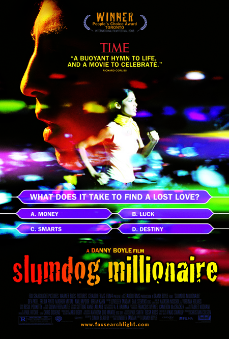
And I like it. A proper representation of this whirlwind of a film:
It looks happy and messy. I’m sure it is all like the film. I mean that positively.
Colorful and flashy, I love it! This one’s definitely among my most anticipated flicks this year.
I’m sorry i really don’t like this poster, it might mostly be the cheesy cheesy font they use for the title.
Clearly, you’re not a designer. Love the movie, but the poster is terrible. That font is so painfully dated. It’s a rush job.
Yeah, I love the imagery, but the typeface looks cheap. I wish they’d kept things cleaner, but that’s me.
Comments
5 responses to “Just now getting to this…”
It looks happy and messy. I’m sure it is all like the film. I mean that positively.
Colorful and flashy, I love it!
This one’s definitely among my most anticipated flicks this year.
I’m sorry i really don’t like this poster, it might mostly be the cheesy cheesy font they use for the title.
Clearly, you’re not a designer. Love the movie, but the poster is terrible. That font is so painfully dated. It’s a rush job.
Yeah, I love the imagery, but the typeface looks cheap. I wish they’d kept things cleaner, but that’s me.