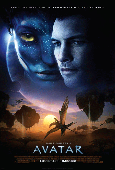
I have mixed feelings about this finalized one-sheet for James Cameron’s “Avatar.” My immediate reaction was that it was, well, a bit cheesy. But then again, it recalls the somewhat majestic poster art of the “Star Wars” films. If the film works and makes good on the hype and promise, I could see this becoming an iconic piece.
Or it could just be cheesy. Today, I like it.
Comments
34 responses to “Final ‘Avatar’ poster”
I like it too. Maybe if it it didn’t have the stuff flying in the sky it would be better?
Seems strange to specify “director of Terminator 2,” as opposed to just The Terminator — almost implies he was only responsible for the sequel.
I think the poster’s hideous, but then I’m totally not the target.
It’s alright…probably a pretty good representation of the film.
It’s not terrible, but it could never be iconic.
it can turn out to be the most amazing movie in the world, break Titanic’s record for Box Office and Oscars, be considered an iconic film, get straight to number 1 on everybody’s favorite film ever…and it would still be an awful poster….and the same can be said for those that came before it.
I mean seriously, look at that font…how can everything after that not suck?
It looks like the poster for a movie called “Titanic… but this time, it’s in space. Oh, and we threw in some blue people”
Come to think about it, that’s what the movie may end up being like…
Well, no matter how awful and Titanic-esque that poster is, I still think it’ll be an amazing film
They pointed out Terminator 2 and not the first film because to those born in 1990, the first Terminator film is a relic.
Hell, the second Terminator film is a relic to them as well. But at least you’ll catch a few outsiders within that demo.
The poster is typical floating head stuff. I’m more excited about the latest tv spot
http://www.youtube.com/watch?v=jQdoWgd5INo
Are you quite sure it’s a FINAL poster? What, no more featurettes, high-res images, special extended trailers left? awwww.
I can’t understand why so many people don’t seem willing to give this film a chance. It’s nice to see something original for once that isn’t based on a comic book, or some other previously existing material. All the production values are sure to be top notch, and I’m sure this is going to look mind blowing in IMAX 3D.
It’s nice to see a prominent filmmaker sticking his neck out a little bit when so many others are just willing to usually play it relatively safe. I think some folks have their minds made up about this film before they even have the opportunity to see it. It’s like they want this film to fail, and go down in flames. Is it just a general dislike for Cameron?? If Spielberg were doing this film would the anticipation be more positive??
Awful poster…
…this film is cannibalized from all sorts of sources, so calling it original is a distortion. Also, we already had an intelligent sci-fi film NOT based on pre-existing material. It was called Moon. Maybe you heard about it?
Also, most of the skeptics, including me, are ALSO 3-D skeptics. Trust me, this isn’t a general dislike of Cameron, except that there is an irritation with his, and subsequently other’s description of this as a gamechanger. Plus, it looks adolescent in story and character. Last, I’m tired of CGI unless used really inventively, which Avatar doesn’t seem to be. I’ve seen this stuff before, and insisting it’s original doesn’t make it so.
Oh, and it really doesn’t help that Tapley is supporting it. This post is a prime example of how irritating he’s been about it. He can’t even call an abysmally made poster awful because it has Avatar on it.
One more thing: Spielberg wouldn’t be doing this, because Spielberg at least has the sense not to do Dances With Smurfs.
Spielberg did make the god awful Indy 4.
Haters to the left SHAAARK!
When are you seeing Avatar?
Kris, you have seen the film now, yes? I wonder if this is one of the reasons for “liking it today”…
I believe Kris and Anne are seeing it tomorrow.
Sorry, that is one seriously uninspired poster.
For some reason I’m reminded of “Delgo”.
Always go with your immediate reaction.
This is about on par with the two songs from Invictus.
It’s not enough that the heads are floating, so they decided to throw in some floating landscape as well! And a floating alien pterodactyl and futuristic helicopters for good measure!
“If Spielberg were doing this film would the anticipation be more positive??”
No, I’m pretty sick of Spielberg too.
The poster is typical, but Amazon has clips of James Horner’s score up now, and it’s pretty amazing. Horner doing what he does best but adding a lot more flavor (almost like he met Thomas Newman in the African sahara). I’m excited.
Pretty bad, but that’s par for the course most of the time when we talk Hollywood movie posters these days. It’s not better or worse than most stuff out there, sadly.
Actually, what bugs me the most about it is that they put Sam Worthington’s face on there. He’s not a recognizable star (yet) so it doesn’t really make much sense to put him on the poster even if he is the main character. What will sell tickets for this is the Na’vi, and the promise of action (the latter which has been surprisingly absent from print material, all the while trailers are chock-full of action, a curious disconnect).
How will the blue aliens sell the film? They’re terribly designed.
Also, Dances With Smurfs.
Dances With Smurfs
Dances With Smurfs
some real idiots posting on this page.
This would be an awesome poster without those giant floating heads. If they’d just had the gumption for that tiny sunset tableau beneath the huuuuge moon… gorgeous
There’s nothing wrong with floating heads if they’re done right, you dolts. Stop believing everything you’re told. Why is it so bad?
I think the reason people (myself included) don’t want to see this movie and are kinda hoping it bombs is that it feels like they’re just trying to shove it down our throats whether we want it or not. Audiences are supposed to decide what movies have big buzz going in. Cameron and company don’t want to leave that to chance though, you know, because audiences are stupid and we’ll like what they tell us to like. So they’re manufacturing as much buzz as possible, not caring that it isn’t genuine and that most people are kind of on the fence about it. This isn’t really a must-see for people outside the industry or outside the Cameron fanboy realm. I’m sure it’ll open nicely, but everything depends on that first wave of word of mouth. And that word of mouth has to be great for it really to be huge.
As for the poster and the thought that it might become iconic. Not a chance. It’s as generic as they come. To be honest, it looks like something that the folks at Nickelodeon Studios might come up with. And that’s nothing to hang your hat on.
It looks like an animated movie poster. Even Sam Worthington looks kinda fake in that picture..
If Cameron had any sense, he would have gone to Drew Struzan for the poster. He does all the iconic movies.
But this is not floating heads done right at all. The two heads overlap weirdly, creating an awkward effect.
“This would be an awesome poster without those giant floating heads. If they’d just had the gumption for that tiny sunset tableau beneath the huuuuge moon… gorgeous”
You mean, something like this? The pterodactyl and Cherodactyl are even quite similar in silhouette.
@Speaking English: What SHAAAARK said.
@Guy: I see what you’re doing there, but only if the Cherodactyl is the size of the pterodactyl here. ;)
Seriously, people, look at the above poster again and try to imagine if those two hulking heads were absent. That is one gorgeous poster, but over-layered.
I love it. The shade of blue is damned impressive, much like the teaser poster.
Kris hit it on the nose with the Star Wars comparison. I love this poster. If only Drew S. had hand-drawn it like the Star Wars, Indiana Jones, etc. posters. That would have been EPIC.