


Sorry for the MIA. I’ve been back east all weekend and opted out of an Off the Carpet column this week because there’s just so little worth discussing. We’re in that pre-November lull of the season, after all. But one thing I wanted to address upon returning was a new, privately-designed one-sheet for “Drive” that absolutely nails the film.
The marketing for Nicolas Winding Refn’s film, which was distributed domestically by FilmDistrict, never seemed to wrap its head around the film’s atmosphere. Adopting the hot pink retro lettering of the film’s title sequence and slapping a hunky Ryan Gosling, shirt unbuttoned, staring into infinity, I guess they were looking to grab a female audience that wasn’t going to show up on their own. The film did well enough against its budget, but when you figure in marketing (a number that goes up and down depending on the source), it wasn’t a huge win. But they’ll tell you they’re happy with it.
Regardless, that’s not my point. The materials, from that one-sheet, to the out-of-context scene-grab outdoor campaign people in major metro areas saw, it just didn’t represent the cool of the film. Nor did it properly contextualize that cool, in my humble opinion.
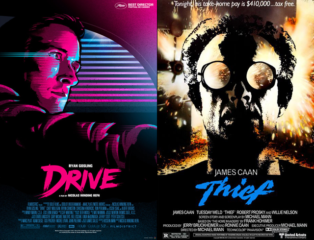
One of the obvious touchstones for the film was Michael Mann’s “Thief.” When I asked Refn about the similarities between the two films at Comic-Con, he naturally backed off it by noting that the two stories are only comparable in that they belong to the genre of neo-noir, but it’s obvious there are more connections there. The way Refn films Los Angeles is unlike any other director’s vision since Mann, the story of a man and his work is very much at the center of all of Mann’s films but certainly a fixture of “Thief,” and the idea that that work defines the character even more than his dreams of breaking free of it.
“Drive” is a modern-day “Thief,” and Refn should own that. But hey, I get it.
In any case, this new poster reminded me of “Thief” very much, but more importantly, I think it captures the vibe, the loneliness, the retro-cool and the focused intensity of the film better than anything FilmDistrict managed.
Here is the poster, courtesy of Signalnoise. I’ve put it alongside the “Thief” one-sheet (one of the all-time greats) for a bit of comparison.
 Archives