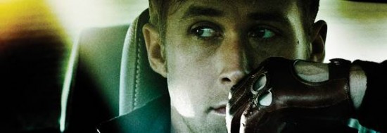
Or, as a “Top Chef” contestant might title this post, “Drive” Four Ways. The US teaser poster for Nicolas Winding Refn’s Cannes winner unveiled a couple of weeks ago — the one that handily doubles as the cover for Ryan Gosling’s upcoming workout DVD — met a mixed reception. Some liked the kitsch, star-centered romanticism of it (though I can’t top Nick Davis’s “Aaron Carter inspirational cassette single” analogy), while many others thought it did an inadequate job of selling the film’s genre components. The film’s a fast-car thriller — where were the cars? And the thrills?
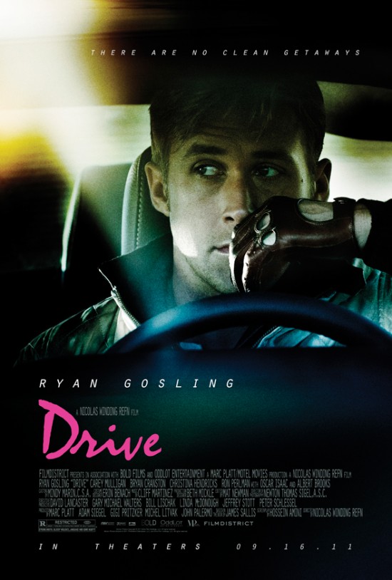
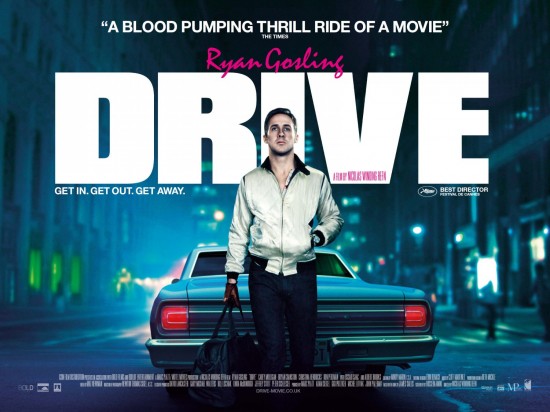
Those objectors should be appeased by the film’s new US and UK one-sheets, both of which retain The Gosling Factor while shading in a little more of the action-film context. (A faint hint of camp is still present in the film’s trademark hot-pink cursive.) The US poster wins on the design front — and props for including a glimpse of the film’s key fetish object, Gosling’s leather driving gloves — but loses major points for recycling a tagline indelibly attached to “No Country for Old Men.” What were they thinking? Check ’em out after the cut.
New US one-sheet:
New UK quad design, with superior tagline:
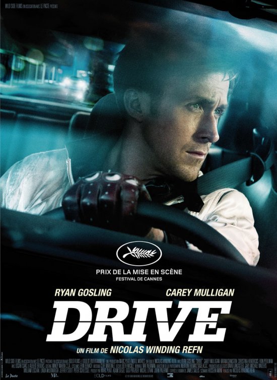
French poster — not as good as either, but interestingly, the only one that gives Carey Mulligan above-the-title billing.
And finally, in case you’re bored with Ryan Gosling’s face, a design I might prefer to any of these: the film’s soundtrack cover.
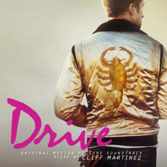
[Images: Film District, IMPAwards, Ace Showbiz]
Comments
28 responses to “New ‘Drive’ posters”
So mysterious! What is watching on the reach view mirror? Is the car too close? Is it the high-beam.
The most pressing question is: putting up the collars is back?
Like others have said, the pink font bugs.
It’s in the movie. You’ll have to come to terms with it.
;)
I love that pink font…very 80’s, not a look I’ve seen in posters lately.
Isn’t that tagline ripped from No Country for Old Men? Still looks very interesting.
How violent is the movie?
“Fright Night” blatantly swiped the “NCFOM” poster design, and now “Drive” gets the tagline. Sincerest form of flattery and all that, I guess.
Isn’t that tagline ripped from No Country for Old Men?
Yes, it is. I do mention that in the post, actually.
As for the violence, it’s pretty ultra, but also highly stylised.
Can someone explain to me what is the deal with the pink font? Men don’t go see action movies with pink font as the title. I will see the movie regardless but I don’t get the pink font
@ Bill M
In perusing the interwebs, some think the pink font is supposed to be an ode to the font/style found in the packaging of video games like the “Grand Theft Auto” series. Others say that it’s supposed to invoke a distinct 80’s feel (and considering that I’ve heard this movie is very Michael Mann-ish, throwbacks to such styles as those found in “Miami Vice” would make sense). Whether any of this is true is up for debate, just speculation.
I knew hipsters always wanted their own fast and the furious. And it looks like they got it.
Iz just playin
[…] InContention] AKPC_IDS += "7189,";Leia também:Who’s that guy?Enquanto isso, no mundo do Povo Bonito de […]
I like these MUCH better than the previous poster. Having said that, the more I see the pink font the less I like it. Oddly enough, I like the UK poster best. “Drive” is a sexy, mysterious, eye-catching word/title. Putting it front and center works for me. Putting Gosling front and center works for me, too (ha!), but I’m still not convinced he’s a big enough star yet to be the main focus of the poster.
Regardless, I can not WAIT to see this movie.
The No Country For Old Men tagline wasn’t exactly original: Soderbergh’s Traffic had already told us that ‘No one gets away clean.’
That carries a very different meaning from the “no clean getaways” line, though. Words are obviously endlessly malleable and versatile, but I think copying the exact same tagline as a successful recent film is not on.
It’s not like that tagline is attached to No Country like say “why so serious” is attached to The Dark Knight. Most people wouldn’t know it was the same line if you hadn’t mentioned it.
Guy, out of curiousity, what is it that makes Albert Brooks’ performance in this awards worthy. He’s a great actor, but it looks like he’s just playing a standard mob boss type, which isn’t something I see the Academy going for.
***Most people wouldn’t know it was the same line if you hadn’t mentioned it.***
So? Does that make it any less of an egregious steal?
“I knew hipsters always wanted their own fast and the furious.”
Except if you’d actually seen the film you’d know cars actually figure into the far less than one might suspect. But, really, don’t let the facts get in the way of your attempt at a witty, generational put down. They’re so fun!!!
Guy: No, I agree.
DylanS: As is so often the case with awards, not just the performance — which is itself grandly entertaining, in the flashily villainous register that often finds favour in the Supporting Actor category — but the actor. Brooks is a beloved industry veteran, this is his first film in six years and he’s playing wildly against type — to me, it all adds up.
Wow, I didn’t realize it’s his first film in six years. The Academy sure does love themselves a comeback.
Glenn: Bitch, chill, if you saw my comment below you’d know it was sarcasm. It’s only a movie, don’t get defensive.
Guy, what are your thoughts on this film factoring into the Best Picture race? The reviews have been glorious, and while I realize that doesn’t always add up to an Oscar nom, it seems to have a bit of the prestige factor as well with the Cannes win.
‘Inception’ wasn’t the ideal Academy friendly film but made the cut, although it was in the bottom half and probably wouldn’t have done the same business this year with the news rules- maybe there’s a chance?
@Bill M & The Dude- Refn mentioned at the Cannes press conference that he was inspired by the early Cassavetes films- particularly ’16 Candles’. The pink font on the ’16 Candles’ poster is undeniably similar to ‘Drive’.
Dana: Words like “never” have a habit of biting me in the ass, but I really don’t see it happening. The film’s too cool, too stylised, too heartless for their liking — and while I expect it’ll do well, it’s certainly not going to be a smash of “Inception” proportions.
As I’ve said before, the films to which “Drive” is an obvious tribute — think early Mann and Walter Hill — never rang the Academy’s bell, so there’s little reason to assume this one will. I’d love to be wrong, though.
Sounds about right, Guy. I figured it wouldn’t have a huge shot but here’s hoping anyway.
It’s a shame though- I haven’t heard so much applause for a film this year quite like ‘Drive’. I guess old folks *ahem* the Academy just can’t live outside the box.
[…] for the part, but sadly, at least thus far, he doesn’t seem to be much of an actor. In Contention loves the motion picture soundtrack cover for Drive more than the movie posters. Fair enough… […]
Saw some amazing character posters for DRIVE today in the NYC subway… just iconic pics of both Carey Mulligan and Christina Hendricks. Does anyone know who designed them? They look brilliant.