
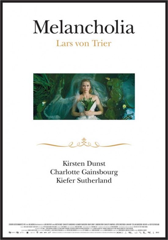
One of the mostly eagerly awaited films of next month’s Cannes Film Festival, Lars von Trier’s latest has just unveiled an international one-sheet — and while it’s less than illuminating, employing only a single (lovely) still we’ve already seen amid an ocean of white space, I’m happy for this one to play coy. Meanwhile, I suspect the wedding-invitation look is intentional. (On a side note, I’m amused by the number of outlets already labelling the film “controversial” before we’ve even laid on eyes on it. At this point, von Trier could do a shot-for-shot remake of “The King’s Speech” and still get the fainthearts quivering ahead of time.) Full poster, courtesy of the film’s website, after the cut.
Comments
23 responses to “‘Melancholia’ poster”
Fan art in all its dubious glory
It’s not fan art. It’s from the film’s official website, sent to me by its publicists this afternoon.
Give me some credit.
This can’t be a real poster, can it? The poster is hideous, that IS fan-art in the sense that some fan could’ve made that in 2 minutes easily. This has to be some pseudo-cover they made to print on press documents or something, because that is an absolutely terrible, terrible poster. Let’s hope someone out there comes up with something brilliant for this by the time we get to Cannes! Making good looking posters shouldn’t be that hard…
Guy, I totally trust you and your sources, but I also trust your judgment – and this sheet does look, to put it mildly, kind of makeshift, don’t you agree?
I doubt it’s the last poster for the film we’ll see — films often enter festivals with fairly rudimentary materials, after all.
I’m not crazy about it either, but I think there may be method in its blandness — am I just imagining the wedding-invitation allusions?
That poster is on the official website, which has apparently crashed.
It’s obviously minimalist for a reason. The stills however are beautiful.
When you put more work into the credits, you know you did a crappy job.
I like the idea of it resembling a wedding invitation, however it does look too rushed-together. I think if the still were a little bigger and the font a lot more elaborate, this could have been a cool poster. But, alas, I find the end result pretty disappointing.
I see the wedding invitation idea, but the whole thing is kind of ugly. Maybe if there was less white space? The central picture larger with some sort of framing one the edges of the central photo? It somewhat reminds me of the A Mighty Heart poster, except even cheaper looking.
Guy, I personally first thought of an obituary. Maybe the fact that we get vibes of both is intentional?
I think I would love it even more if the image was bigger. Maybe if it reached out to the edge of the poster?
Andrew – You mean that wedding invite theme would look better if it looked like this?
http://media2.firstshowing.net/firstshowing/img2/melancholia-new-inviteposter2.jpg
Yea, I whipped that up in about 30 mins. Didn’t take much work. This poster above must’ve taken some publicist… what, about 2 minutes to make?
Lars von Trier’s movies are terrible. Kirsten Dunst and Kiefer Sutherland are terrible. Melancholia will most likely be…
Agree James. LVT is an impressive stylist but nothing more. One of the biggest (and sadly most successful) frauds of arthouse cinema.
The poster made me puke. Looks like it was made in 5 minutes on MS Word.
LVT is someone who – I watch his films because there’s this enormous arthouse buzz – and then when they’re over, I say … that’s it?
And I don’t mean that in a “that was tame” way. Not at all. I don’t think anyone could call Dogville, Breaking the Waves, or Antichrist tame.
No, it’s just … I don’t see what all the fuss is about, really. His films are, at the very least, interesting (if not absurd). I’ll see Melancholia because I try to see everything, but … don’t really get the intense, exacting appreciation.
Then again, that can be said of any auteur. But we’re talking LVT right now, so.
Then again, that can be said of any auteur.
You mean there isn’t one auteur who wows you from time to time?
Ha, no what I mean to say is: everyone has their one (or more) auteur(s) who just don’t do it for them.
When I said “any” I meant random, not as exclusively all auteurs. Sorry for my sketchy wording.
***You mean there isn’t one auteur who wows you from time to time?***
Michael Bay, perhaps? Then again, I rather liked “The Island”… (don’t judge).
You’ve misread the question, English.
But anyway, I love ‘The Rock’.
Bay must be considered an auteur, no? Whether he’s any good or not.
Alex: That is exactly what I’m talking about! The one you whipped up is already 10 times better than the original.
English: That’s not my point. You read the question as, “You mean there isn’t one auteur who doesn’t wow you from time to time?”
Anyway, not important — the initial question hinged on a misunderstanding on my part.
[…] for Melancholia, Transformers: Dark of the Moon, Sleeping Beauty, The Hangover Part II, and both a big banner and […]