Nicole looks like a goddess, Penelope is Loren-esque, hell even Kate looks hot!
But where are Dench and Loren? Will they be releasing a special poster for seniors?
ganonlink
Crap poster and the paparazzis are taking photos of DDL’s crotch, LOL.
mark
CRAP with their budget couldn’t they put more effort in and fancy leaving out the legends dench and esp loren.
Mr. F
Kidman looks gorgeous.
Michael
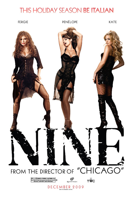
It seems that there are two other film posters that have also been released today. One is in the style of a 1960s Felini poster and the other features Hudson, Cruz and Fergie.
Nice photoshop job. I never realized Kate Hudson’s head was twice as large as Nicole Kidman’s till I saw them side-by-side like that.
It also looks like a very natural way for 5 people to stand next to each other.
It hurts my brain to think someone actually got paid to make this. In fact, someone else got paid even more to okay this and release it.
Ken L.
So I guess they’re going with “Fergie” instead of Stacy Ferguson?
Michael
I could have sworn she was listed as Stacey Fergueson in the credits of the actual movie. I guess for marketing purposes, she’s better known as “Fergie”
Antinook
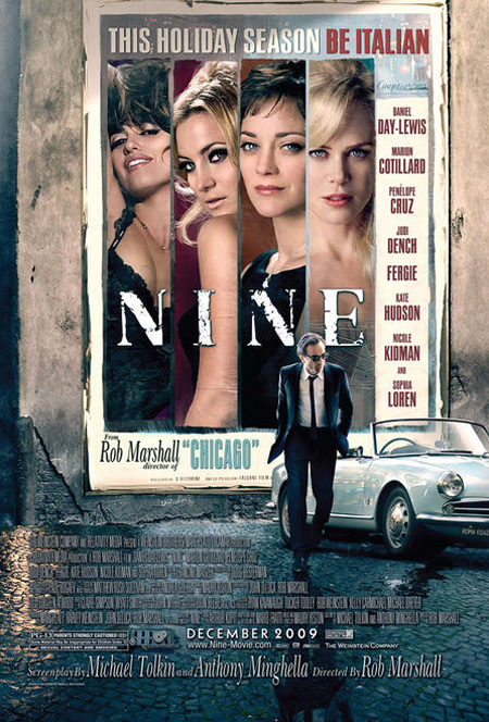
I agree Erik, they look fanmade, done in 30 minutes. I can’t stand Guido’s mirror reflection on the pavement! And the paparazzi on Guido’s package?
The one with car had a good intention, the fonts are like vintage italian posters, but their faces actually dont look like that, so it doesn’t work.
SHAAAARK
Aaaaagh, these are horrible. oh, I have such mixed feelings for this. Love Cruz, Cotillard, and Day Lewis, and like Kidman and Dench, but bleeeeeggh Rob Marshall.
As I ranted over on Awards Daily just now, there’s absolutely no way the first one is official. It is either a fan-made amateur creation, or a (very) rough draft/idea that was never meant to come out. There was just way too many things about it that are wrong for it to be official.
I have to say, so far the Nine campaign has been absolutely awful, poster-wise, and all over the place with all these designs.. All the more reason to think they’re rejected concepts and not the actual poster.
Why don’t they take a note from the official site? The font, color and feel of it is way better than any of these.
Seanny
I really like the first one ( although it seems they are hiding Marion Cotillard), and the second is pretty good but there will obviously be more similar ones with different actresses. But the third is awful. Really bad. I like that Marion is credited second (I think she is quite likely to score a nom in lead) but it seems weird that Kidman and Hudson are so prominently featured but are so low on the credits. I want Judi Dench on the poster, and Sophia too. They are are best.
Andrew R.
The first one is too busy, I love the second one, and the third is almost perfect. I just wish the ladies faces seemed more painted/drawn onto the wall or maybe black and white.
aspect ratio
I’d say these are more likely to be rejects and early drafts that weren’t supposed to get out than fan-made amateur concepts (mainly because the imagery used doesn’t seem to be available publicly).
Dan
The credits are in alphabetical order (minus Day Lewis, of course).
Benito Delicias
they’re beyond horrible…
the one with all the women dancing with Guido in the middle would’ve been better, that one, Japanese I think, needed better font work and distribution and it would’ve been more than enough.
The first one is just a photoshop disaster.
The second one is just horrible.
The third one doesn’t make sense, although the idea was great. Also, isn’t weird that the company that makes the posters doesn’t have more images from the movie than those that have already been released and used everywhere for months?
al b.
At least we GET posters! They took forever to release these!
They really are a collection of hot messes. The top one is dreadful. I like the idea behind the third one, however, but the execution could be better. MUCH better.
Andy
I agree that they are a little dodgy with the photoshop, but I love the third one. First one is really bad though – but Cruz <3
sebastian
the first one is not good. it looks like the photographers are obssessed with guido’s penis…
Nigel Bridgeman
They should really just have a single poster with Penelope Cruz and be done with it. Who wants to see anyone else with her looking like that?
I keep getting interested in this film until I remember that Hudson and Kidman are in it.
Aleksis
Is this film as misogynistic as it sounds, and these posters make it look?
To be perfectly honest, I’d be obsessed with Daniel Day-Lewis’ crotch too if it was shoved right in front of me. He’s a sexy sexy man so why not?
Antinook
In another forum, I said that this flashing lights to DDL’s crotch could be a subliminal message, introducing him as a stud, with all those women too. But somebody laughed at me.
Hot damn folks, that movie is gonna be soooooo sexy.
aspect ratio
Thanks Kris, for confirming.
As a graphic designer, I’m offended. How can studios spend millions upon millions on making these films, then put this out to promote it? It makes no sense at all, it’s like building a Porsche and putting a lawnmower engine in it.
Alex
Those paps in the first poster look like they are trying to get some upskirt shots.
They put the ‘pap’ in ‘pap smear’. Yes I just typed that.
Hey Kris! – I just noticed that your sidebar oscar predictions now list Star Trek for Best Picture. Was The Lovely Bones really a disappointment?
Blimp
What fugly posters.
Alex
Sneaky sneaky.
Is there any chance Inglourious Basterds could sneak into the top 10? Having seen it again recently, I thought it was quite good (except for the Basterds and Brad Pitt). The parts with Melanie Laurent, Christoph Waltz, Michael Fassbender and Diane Kruger were well done. The final ten minutes of the film were breathtaking. Surely it’s better than Star Trek.
Andrew
Too slutty for my taste.
Moon
Kris – heart rate or blood pressure? (The thought thought of heart pressure scares me!)
Yes, this is my first post here, and THIS is what I choose to comment on!!
Agree with the general consensus on the quality of the posters…
Andrew
Aleksis, I agree: these just look plain misogynistic.
The first one is actually the best, but what’s with the slogan? Awful.
The second one just looks like complete garbage. Way too much contrast, the actresses’ costumes look terrible (especially Fergie – what dumpster did she crawl out of?), and the NINE font just doesn’t go with anything else.
The third one could’ve worked, if they left the photoshop alone. The actresses look too airbrushed, and way too many fonts are used. It’s just muddled.

Comments
42 responses to “‘Nine’ posters”
Kidman makes everyone else seem unnecassary. Too bad it might be the other way around in the film.
Oh, and I hope Dench gets a poster all for herself!
The tagline sounds like a Fazolis commercial slogan.
I’m dying to see this, but could you crap any more Photoshop onto this poster?
I like it, but LOL, Chad. I agree. :P
Nicole looks like a goddess, Penelope is Loren-esque, hell even Kate looks hot!
But where are Dench and Loren? Will they be releasing a special poster for seniors?
Crap poster and the paparazzis are taking photos of DDL’s crotch, LOL.
CRAP with their budget couldn’t they put more effort in and fancy leaving out the legends dench and esp loren.
Kidman looks gorgeous.
It seems that there are two other film posters that have also been released today. One is in the style of a 1960s Felini poster and the other features Hudson, Cruz and Fergie.
http://movies.yahoo.com/photos/movie-stills/gallery/1816/nine-stills#info
http://broadwayworld.com/board/CurrentSearch_Detail.cfm?ID=41472
Nice photoshop job. I never realized Kate Hudson’s head was twice as large as Nicole Kidman’s till I saw them side-by-side like that.
It also looks like a very natural way for 5 people to stand next to each other.
It hurts my brain to think someone actually got paid to make this. In fact, someone else got paid even more to okay this and release it.
So I guess they’re going with “Fergie” instead of Stacy Ferguson?
I could have sworn she was listed as Stacey Fergueson in the credits of the actual movie. I guess for marketing purposes, she’s better known as “Fergie”
I agree Erik, they look fanmade, done in 30 minutes. I can’t stand Guido’s mirror reflection on the pavement! And the paparazzi on Guido’s package?
The one with car had a good intention, the fonts are like vintage italian posters, but their faces actually dont look like that, so it doesn’t work.
Aaaaagh, these are horrible. oh, I have such mixed feelings for this. Love Cruz, Cotillard, and Day Lewis, and like Kidman and Dench, but bleeeeeggh Rob Marshall.
Saying they look fanmade is an insult to fans.
Amazing posters!
Penelope Cruz… damn.
As I ranted over on Awards Daily just now, there’s absolutely no way the first one is official. It is either a fan-made amateur creation, or a (very) rough draft/idea that was never meant to come out. There was just way too many things about it that are wrong for it to be official.
I have to say, so far the Nine campaign has been absolutely awful, poster-wise, and all over the place with all these designs.. All the more reason to think they’re rejected concepts and not the actual poster.
Why don’t they take a note from the official site? The font, color and feel of it is way better than any of these.
I really like the first one ( although it seems they are hiding Marion Cotillard), and the second is pretty good but there will obviously be more similar ones with different actresses. But the third is awful. Really bad. I like that Marion is credited second (I think she is quite likely to score a nom in lead) but it seems weird that Kidman and Hudson are so prominently featured but are so low on the credits. I want Judi Dench on the poster, and Sophia too. They are are best.
The first one is too busy, I love the second one, and the third is almost perfect. I just wish the ladies faces seemed more painted/drawn onto the wall or maybe black and white.
I’d say these are more likely to be rejects and early drafts that weren’t supposed to get out than fan-made amateur concepts (mainly because the imagery used doesn’t seem to be available publicly).
The credits are in alphabetical order (minus Day Lewis, of course).
they’re beyond horrible…
the one with all the women dancing with Guido in the middle would’ve been better, that one, Japanese I think, needed better font work and distribution and it would’ve been more than enough.
The first one is just a photoshop disaster.
The second one is just horrible.
The third one doesn’t make sense, although the idea was great. Also, isn’t weird that the company that makes the posters doesn’t have more images from the movie than those that have already been released and used everywhere for months?
At least we GET posters! They took forever to release these!
Aspect: These are official, direct from the studio.
They really are a collection of hot messes. The top one is dreadful. I like the idea behind the third one, however, but the execution could be better. MUCH better.
I agree that they are a little dodgy with the photoshop, but I love the third one. First one is really bad though – but Cruz <3
the first one is not good. it looks like the photographers are obssessed with guido’s penis…
They should really just have a single poster with Penelope Cruz and be done with it. Who wants to see anyone else with her looking like that?
I keep getting interested in this film until I remember that Hudson and Kidman are in it.
Is this film as misogynistic as it sounds, and these posters make it look?
To be perfectly honest, I’d be obsessed with Daniel Day-Lewis’ crotch too if it was shoved right in front of me. He’s a sexy sexy man so why not?
In another forum, I said that this flashing lights to DDL’s crotch could be a subliminal message, introducing him as a stud, with all those women too. But somebody laughed at me.
Hot damn folks, that movie is gonna be soooooo sexy.
Thanks Kris, for confirming.
As a graphic designer, I’m offended. How can studios spend millions upon millions on making these films, then put this out to promote it? It makes no sense at all, it’s like building a Porsche and putting a lawnmower engine in it.
Those paps in the first poster look like they are trying to get some upskirt shots.
They put the ‘pap’ in ‘pap smear’. Yes I just typed that.
Hey Kris! – I just noticed that your sidebar oscar predictions now list Star Trek for Best Picture. Was The Lovely Bones really a disappointment?
What fugly posters.
Sneaky sneaky.
Is there any chance Inglourious Basterds could sneak into the top 10? Having seen it again recently, I thought it was quite good (except for the Basterds and Brad Pitt). The parts with Melanie Laurent, Christoph Waltz, Michael Fassbender and Diane Kruger were well done. The final ten minutes of the film were breathtaking. Surely it’s better than Star Trek.
Too slutty for my taste.
Kris – heart rate or blood pressure? (The thought thought of heart pressure scares me!)
Yes, this is my first post here, and THIS is what I choose to comment on!!
Agree with the general consensus on the quality of the posters…
Aleksis, I agree: these just look plain misogynistic.
The first one is actually the best, but what’s with the slogan? Awful.
The second one just looks like complete garbage. Way too much contrast, the actresses’ costumes look terrible (especially Fergie – what dumpster did she crawl out of?), and the NINE font just doesn’t go with anything else.
The third one could’ve worked, if they left the photoshop alone. The actresses look too airbrushed, and way too many fonts are used. It’s just muddled.