39 responses to “Another poster — ‘Revolutionary Road’”
JAB
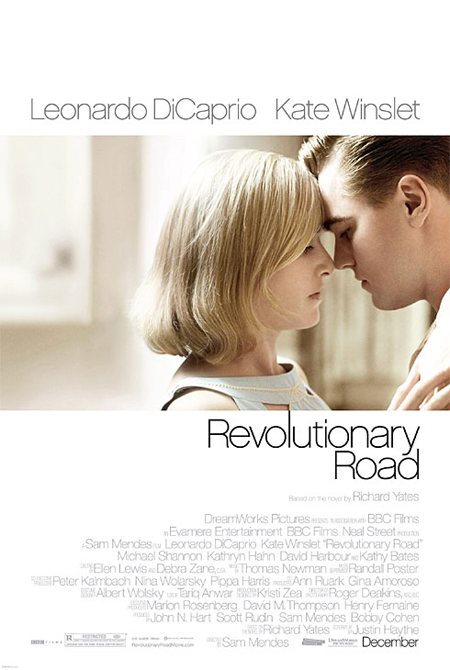
This could just be because I really want to see and like this movie, but I think it’s perfect. It shows it’s stars, and each of them has some true raw emotion on their face.
Bryan
Love it.
Daniel Deporte
the greatest movie of the year. I hope so…
One image. Much emotion envolved. Great.
Sean
Smart poster…you would never know it was a 1950’s period piece which wouldn’t bring box office.
Aaron
I really like it. Classic and simple. I have high expectations for this movie. I hope it’s good!
Ivan
The style is so Margot at the Wedding, but a nice photograph, its all about the hair!Kate the Great
Look, I want to see the movie as much as the people inexplicably saying they love this image.
I don’t love or hate the poster, but are people really seeing “raw emotion” in that picture? They each look pretty blank…
I’m a bit more than halfway through the book, and this poster doesn’t give you a clue what’s involved, nor does it particularly tantalize or make one curious. It seems like it’s trying to appeal to the “Titanic” fangirls that just tells you “they’re in another movie!”
Jacob
Elegant? Yes, but it’s too simple and I don’t think it matches the tone of the film. Too much white, bad typography, and I don’t think the photo is all that powerful.
But it doesn’t make me want to see the movie any less.
jason
looks like the match point poster
Jim
At first, I was like “Aren’t they supposed to be unhappy? Why all that light? Shouldn’t it be darker?” But then I thought, the whole point is that they are unhappy deep down, despite their superficially successful lives.
I actually don’t think I’d mind this poster nearly as much if even one of them had some sort of emotion conveyed with their face OR a tagline establishing all is not perfect.
As is, it seems the poster was haphazardly thrown out there to appeal to the LCD.
Liz
I’m not crazy about it. Like other people said, it doesn’t seem to match the tone of the trailer, but I also didn’t think the trailer matched the tone of the book, so maybe I’m just being stubborn.
I agree, Jonathan. I would have liked to see a more 50s-style look.
Ben
Aside from being a fairly simple design, I also think it may be the wrong way to sell the movie. The poster seems to be going after Titanic fans by highlighting the reunion of the two actors and also suggesting a more romantic story, but from what I have read about the film’s story it is pretty depressing and such a marketing approach could lead to bad word of mouth.
Patrick
Deceptively light. This may help pull in unsophisticated viewers. We elitists, however, will not be fooled.
They want coin and that is what this poster will do, looks sort of similar to Titanic (since they are the only people we see) and as mentioned above, doesn’t show that it is a 1950’s piece
garbogarbo
Jocomomola!!!
The Z
When hasn’t a film by Mendes not had a great poster?
Chad
How come Kathy Bates gets no love in the Titanic reunion press blitz?
Andrew
Awful.
Too simple for it’s own good – instead, it looks boring. At least the “Margot” poster had a flash of colour.
Dan
i actually don’t like the poster at all. Just BLAH and for a depressing movie this doesn’t seem fitting
JAB
i just need to say somewhere that i was fairly unimpressed with Burn After Reading…it was okay, but i don’t see any Oscar Potential.
Liz
Definitely, JAB. I actually thought it was kind of bad. Not funny, not dramatic, just stuck somewhere in movie limbo.
I’ve also been looking for a place to say that.
The Z
Now that I’ve thought about it, this reminds me of the poster for “My Best Friend’s Girl.” I think it’s the big blocks of white.
[…] the way, I’ve been told the poster for “Revolutionary Road” that dropped a few weeks back is indeed a teaser and that a final one-sheet is still to come. Looking forward […]
[…] few weeks ago I mentioned that the first poster for “Revolutionary Road” was a teaser and that there would be another one-sheet on down […]
Michel
Why would they use Helvetica for a film that supposedly takes place in the 1950s/early 60s? Futura would have been better.
K.S.G.
Agreed, Helvetica makes it look too modern.
Derrick K.
I’m appalled by the use of Helvetica on this poster. Agree it does not signify the time period.
Futura would have been a great choice, but maybe too sterile. In which case why not go all out with a period look?? Movie posters from the time were really exciting. This one makes me want to go to sleep.
Comments
39 responses to “Another poster — ‘Revolutionary Road’”
This could just be because I really want to see and like this movie, but I think it’s perfect. It shows it’s stars, and each of them has some true raw emotion on their face.
Love it.
the greatest movie of the year. I hope so…
One image. Much emotion envolved. Great.
Smart poster…you would never know it was a 1950’s period piece which wouldn’t bring box office.
I really like it. Classic and simple. I have high expectations for this movie. I hope it’s good!
The style is so Margot at the Wedding, but a nice photograph, its all about the hair!Kate the Great
NOT the reactions I was expecting. I personally think it’s creatively lacking for obvious reasons. But hey, to each his own!
The style is so Margot at the Wedding, but a nice photograph, its all about the hair!Kate the Great
really powerfull.
I agree with all the previous posters.
Also, if you squint your eyes and look close enough you can see an iceberg in the background.
Looks like the Baby Face Nelson love/crime biopic.
Looks like they made the picture so small so they could fit all those names underneath.
I wonder what the polish poster will look like.
I am not looking foward to this film really something has always seemed off anf the trailer didn’t help.
But the poster looks good, simple and elegant actually
Look, I want to see the movie as much as the people inexplicably saying they love this image.
I don’t love or hate the poster, but are people really seeing “raw emotion” in that picture? They each look pretty blank…
I’m a bit more than halfway through the book, and this poster doesn’t give you a clue what’s involved, nor does it particularly tantalize or make one curious. It seems like it’s trying to appeal to the “Titanic” fangirls that just tells you “they’re in another movie!”
Elegant? Yes, but it’s too simple and I don’t think it matches the tone of the film. Too much white, bad typography, and I don’t think the photo is all that powerful.
But it doesn’t make me want to see the movie any less.
looks like the match point poster
At first, I was like “Aren’t they supposed to be unhappy? Why all that light? Shouldn’t it be darker?” But then I thought, the whole point is that they are unhappy deep down, despite their superficially successful lives.
Generally, I like it. I love the layout, the type face, the use of white space … though the image itself could, I think, be a bit more striking.
Still, compared to some other posters we’ve seen lately, it’s refreshingly clean and restrained.
I like the poster itself. But not really for the movie it is advertising. I´d have wanted a more 50´s look. Is that one of your issues too Kris?
I actually don’t think I’d mind this poster nearly as much if even one of them had some sort of emotion conveyed with their face OR a tagline establishing all is not perfect.
As is, it seems the poster was haphazardly thrown out there to appeal to the LCD.
I’m not crazy about it. Like other people said, it doesn’t seem to match the tone of the trailer, but I also didn’t think the trailer matched the tone of the book, so maybe I’m just being stubborn.
I agree, Jonathan. I would have liked to see a more 50s-style look.
Aside from being a fairly simple design, I also think it may be the wrong way to sell the movie. The poster seems to be going after Titanic fans by highlighting the reunion of the two actors and also suggesting a more romantic story, but from what I have read about the film’s story it is pretty depressing and such a marketing approach could lead to bad word of mouth.
Deceptively light. This may help pull in unsophisticated viewers. We elitists, however, will not be fooled.
Boring and blah… do not like it.
They want coin and that is what this poster will do, looks sort of similar to Titanic (since they are the only people we see) and as mentioned above, doesn’t show that it is a 1950’s piece
Jocomomola!!!
When hasn’t a film by Mendes not had a great poster?
How come Kathy Bates gets no love in the Titanic reunion press blitz?
Awful.
Too simple for it’s own good – instead, it looks boring. At least the “Margot” poster had a flash of colour.
i actually don’t like the poster at all. Just BLAH and for a depressing movie this doesn’t seem fitting
i just need to say somewhere that i was fairly unimpressed with Burn After Reading…it was okay, but i don’t see any Oscar Potential.
Definitely, JAB. I actually thought it was kind of bad. Not funny, not dramatic, just stuck somewhere in movie limbo.
I’ve also been looking for a place to say that.
Now that I’ve thought about it, this reminds me of the poster for “My Best Friend’s Girl.” I think it’s the big blocks of white.
http://www.imdb.com/media/rm176592640/tt1046163
i love it. i cant wait to see it and hope it lives up to expectations
[…] the way, I’ve been told the poster for “Revolutionary Road” that dropped a few weeks back is indeed a teaser and that a final one-sheet is still to come. Looking forward […]
[…] few weeks ago I mentioned that the first poster for “Revolutionary Road” was a teaser and that there would be another one-sheet on down […]
Why would they use Helvetica for a film that supposedly takes place in the 1950s/early 60s? Futura would have been better.
Agreed, Helvetica makes it look too modern.
I’m appalled by the use of Helvetica on this poster. Agree it does not signify the time period.
Futura would have been a great choice, but maybe too sterile. In which case why not go all out with a period look?? Movie posters from the time were really exciting. This one makes me want to go to sleep.